

- By Dan Veaner
- Business & Technology
 Print
Print 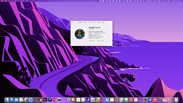
Apple released OS X in March of 2001. 19 and a half years later macOS 11 - Big Sur has arrived. Why the new number? The new version heralds a new era for Apple, because it is in the process of abandoning Intel chips for Apple's own M1 chip. And because it is furthering Apple's efforts to make macOS as much like iOS and iPadOS as possible. The word is that you will even be able to run iPhone apps on Macs that use the new Apple chips.
If you expect dramatic changes in a major operating system (OS) update, Big Sur is going to disappoint you. The past few OS upgrades have strived to make the Mac look and feel more like an iPhone or iPad. For the most part that means making the Apple apps look and feel more like phone and pad versions -- apps like Contacts, Messages, Mail, Music, Notes, Find My, and Maps. While I still feel the Mac versions are a bit behind in that regard, they have pretty much succeeded in doing that, touting the new looks, although the programs themselves aren't much different from what they used to be like.
And some have lost features that made them easier to use. For example, you used to be able to drag a mailbox up into the bar at the top. You can still drag mailboxes, but now only in the sidebar, which is OK, but not as easy to see or drag to accurately.
Safari is supposed to be faster and have some new cooler features. It is and it does, though even here there are a few bumps. I use multiple tabs, and they are supposed to have a little X on one end so you can click them closed. The Xs are randomly disappearing on me, though if I know where they are supposed to be I can still click there to close the tab. It also warns of passwords that have been breached. I do like that if you mouse over the tabs a thumbnail of the site on each tab pops down. But, like OS 11 itself, it seems the best improvements to Safari are under the hood, such as a speed boost to javascript.
Maps has been updated to look and feel like the new iOS/iPadOS Maps. I find it great for city use, but the opposite of great out in the country (where I live) because it is mostly faded green with tiny text. You can set it to 'Use Large labels' which makes street names and other text slightly less tiny. And for major destinations we now have Guides that highlight features of the areas visit. Plus you can work out a route on your Mac and it will be automatically sent to your iPhone to use in your car (and/or with CapPlay).
There have been other hits to my workflow as well. Any time there is a major OS upgrade some old programs stop working, mainly because third party developers haven't kept up with new requirements. Unfortunately some of the things I use on a daily basis have become unusable. A couple of apps show blank, fuzzy dialog boxes instead of the functional ones they are meant to display. An example: in the Seamonkey Composer, which I use every day to write articles for this publication, if I click the button for adding a graphic or a link, or to activate the spell checker -- I can't any more. That makes an extremely useful program unusable.
 Look at what happens when I try to add a link or a picture in Seamonkey Composer. It is certainly the Seamonkey developers' fault for doing something not standard, but a little bit Apple's fault for not being entirely backward compatible. Mostly not on Apple, though that doesn't make me feel better when I can't use one of my most useful apps.
Speaking of dialog boxes, they have been completely redesigned. Now buttons are stacked in a rounded-corner box, rather than buttons like OK and Cancel being side by side. While Big Sur still has that new car smell, I have seen criticism of this new design on Reddit (everybody's a critic on Reddit). But I like the new look of the dialog boxes. I always found dialog boxes to be stodgy looking. Now they seem like it's more exciting to do things, and that's exactly what they're for -- the program is asking you to make a decision about something (thus, 'dialog') and you do it.
And there are other things. Only the new style widgets can be used in the Notification Center. Two widgets that I became accustomed to using multiple times every day -- a calculator and a note pad -- are no longer options. The note pad was a third party program that it will be up to the developer to update. But I am pretty sure the calculator was Apple's.
On my phone and pad I can't put my old widgets on top of or among the new style widgets. But at least I can still keep them-- they are piled beneath all the new ones. I can't arrange them in terms of their usefulness to me, but at least I can still use them. Not so in Big Sur.
And while I'm ranting about the new Notification Center, the old one had two tabs -- one for widgets and one for notifications. Here's why the old way was better: the tabs are gone, and notifications are stacked on top of the widgets, pushing them down. Widgets are supposed to be handy little mini-apps, and having them in the same place every time you open the Notification Center was a great thing for work flow. After all, widgets are things you actually use, while notifications are simply things you look at (most of which you didn't need to read anyway because you already know that an upload has completed or that you've got mail (because the little number on the dock icon tells you so). If there are many notifications you might have to scroll down to find the widget you want to use. And I have not found a place to see old notifications once I have Xed them out, which I do so my widgets won't be pushed down. I have discovered that it is only showing three notification sets at a time.. but that begs the question of how I can see all notifications without deleting the ones on top.
This may not be an issue for you, but I use Noritification Center widgets a lot, so I even went through some hoops using a third party app to assign an F key to open it. Each day I check there are a few more apps listed in the App Store that have the new widgets. But none to replace the ones I have lost in the OS upgrade.
 Notifications stack on top of widgets. That's fine in this picture with only two notifications, but when they really stack up widgets become much less convenient. Picture courtesy of Apple.
So the Notification Center looks cooler, but works less well. Form over function may be nice when you're redecorating your living room, but a computer is a tool, and the primary purpose of tools is that they work well to do the things they are designed to do. That's right -- function should trump form, although there is no reason we can't have both.
As far as the actual OS is concerned, almost all the improvements are under the hood, so to speak. I do appreciate those kinds of things, especially where performance and security are concerned. But you do want some spiffy improvements that you can see and use as well, if only to confirm that the new OS really is new.
One of the few such additions is a Control Center center that is identical to the ones on the iPhone and iPad. I used the Control Center on those devices every day. They are very handy ways to control things like backlight intensity, volume, screen mirroring, and on my i-devices I can even add buttons for my Hue lightbulbs -- very handy! I love me my iPhone and iPad Control Center! (That isn't a typo - it's me being excited.)
 Control Center, fabulous on iOS and iPadOS, seems redundant in macOS because it is easier to do all these things on your keyboard. Picture courtesy of Apple.
The Big Sur Control Center looks exactly the same, and while there isn't much third party support yet, it works the same. But here's the thing -- most of the things it controls have been and continue to be controlled by keys on the top row of the Apple keyboard. There is no key combination I have been able to find to open the new Control Center -- you have to click an icon on the menu bar at the top of the screen, and then work the control you are looking for -- volume, brightness, and so on. So multiple mouse moves and clicks.
Why would I do that when I can just press the volume keys or brightness keys on my keyboard?
So the concept is very nice, but a computer is not a pad or phone and you can only go so far to make it like those devices before you end up with a giant iPad. If that's where Apple is going I think they should call it the iMongo. Or the iKingKong. Or the iZilla.
I thought my iMac was pretty swift, especially after I upgraded its memory to the maximum allowed 32GB. Lately I have been making short, but complex videos in Apple's Final Cut Pro and have run into memory limitations when I get too complex. The newer iMacs can be upgraded to as much as 128GM of memory, and I seriously considered trading mine in. (Note - I am not talking about the Pro iMacs -- those are probably best for intense video editing, but you have to give Apple your an arm, a leg, and your first born to be able to afford one).
While researching the newer iMacs I learned Apple was in the process of switching away from Intel chips, which it has used since switching from its own chips in 2006. The company has just released the first Macs with its new M1 chip -- MacBook Air, 13-inch MacBook Pro, and Mac mini. I believe the new iMacs will be released early next year. So, thinking about longevity, a tenuous concept at best when it refers to computers, now may not be the optimal time to buy a new iMac.
In the meantime I have worked out a way to deal with complex video editing that is a bit of a nuisance, but not nearly as memory-intensive as doing it the regular way. So it didn't make sense to buy a new iMac when the future of iMacs is not with Intel chips.
Maybe that was too much information -- my point is that Big Sur is certainly meant as a bridge operating system between the Intel-based Macs and Apple based ones. Maybe the Intel machines didn't need this upgrade.
All of that said, Final Cut Pro does seem to load faster under Big Sur, and, while it does slow down as my video editing becomes more complex, it seems happier in OS 11 than it was in OSX. Apple's DAW (Digital Audio Workstation), Logic Pro, (also resource-intensive) also seems to have perked up slightly.
 Here are how many apps are taking too long to load on booting my Mac. Finder was one of the most sluggish. They're fine once they load, and programs seem to load fairly quickly once you are done with booting.
 But this is significantly worse than booting Catalina, the previous macOS version.
Let me address performance. As I said, I believe I am noticing better performance in my video editor, which is an amazing, yet heavy-resource using program. So that's good. But I am having trouble with the bootup sequence. The first time I rebooted the screen stayed mostly black seemingly forever before it resolved into my normal desktop. A couple of apps appeared on the black screen, so I knew something was happening. My remaining brown hair turned gray while I waited to see if it would finish booting.
So I powered down and started the computer with the on/off button. Would you believe that Finder froze? Finder never freezes. Well,OK, sometimes it does, but you can always restart it. Not this time!
I am pretty sure this was due to one or two aps I use that load cloud-drives into Finder, so I uninstalled both of them (not easy with Finder not working), and tried again. The third time it did boot OK, though it took its blessed time doing it.
I admit I have a lot of stuff set up to load when macOS loads, so I take some responsibility for this. But things did seem to load faster and with fewer issues under OS X Catalina.
One more minor grouse: I tended to find my own desktop wallpaper images, but I liked the Catalina one, so I used that. Earlier versions also had nece options. Big Sur is the first macOS version where I have actively disliked the wallpaper images that come with it.
They are garish and cartoonish. Did good taste leave Apple when Sir Jony Ives left last year to start his own company? (Ives was the design genius that created Apple's iconic and tasteful looks.) These background images are distracting from whatever work you are trying to do. I picked the one I found least awful, and I admit I do like the feature where it gets darker at night. When the background is the most eye-catching thing... well lets just remember that millions of insects have lost their lives because they flew into the most eye-catching thing, which was also a bug-catching thing.
I'll probably replace it with my own wallpaper when it aggravates me enough.
So bottom line -- should you upgrade?
I think third part developers will, for the most part, catch up, but in the week or so I have been using Big Sur the hits to my workflow have been considerable. And that is not entirely because of third party apps. Apple's workflow shine has somewhat dimmed in this OS version. I believe it will come into its own, especially as the new computers with Apple chips roll out.
And it's not a matter of money. As usual upgrading to the newest macOS is free. Just open the app store and click the 'Get' button. Lest I be criticised by a shaking of your head and a 'you get what you pay for', let me hasten to say that macOS is incredible, and that it is provided to Apple computer owners for free, year after year, is a huge gift. Every one of my criticisms are minor when you weigh them against the overall great design and functionality of this operating system.
But for now, why not wait? What's your hurry unless you want to pin pictures of your favorite people to text with to the top of your Messages screen, or create Memojis (I still don't get Memojis)?
v16i45